
Accessible online education materials ensure that all learners, regardless of ability, disability, or device, can access and interact with content meaningfully. Accessibility is not simply a legal requirement under the Americans with Disabilities Act (ADA); it is a moral and pedagogical imperative. According to King and Piotrowski (2021), failure to meet accessibility standards in online education can result in legal action and, more importantly, can marginalize students with disabilities by creating digital barriers that hinder their participation and success.
In today’s digital learning environments, accessibility involves more than just adding captions or alt text. It encompasses universal design principles, appropriate color contrast, consistent heading structures, and screen reader compatibility. As Rybin Koob et al. (2022) emphasize, equitable access requires ongoing review of digital materials using accessible design tools and intentional instructional design choices.
Review of Accessibility in the Simulated Learning Object
In reviewing and updating my simulated learning object, several accessibility strengths and weaknesses became apparent. Below is a breakdown of what met accessibility standards and what did not.
Elements That Met Accessibility Standards
Correct Color Contrast:
The majority of the body text used compliant color contrast (at least 4.5:1), ensuring readability against the background.
Readable Layout and Font Choice:
The use of sans-serif fonts and appropriate spacing supported legibility and visual clarity.
Elements That Did Not Meet Accessibility Standards (and Fixes Made)
1. Heading Structure
Issue: The heading hierarchy was inconsistent and not formatted using Word’s accessibility structure. Screen readers rely on heading levels (H1, H2, H3) to navigate content effectively.
Fix: I updated all headings to align with Word accessibility standards (H1 for main titles, H2 for subsections). This ensures logical navigation and improved readability.
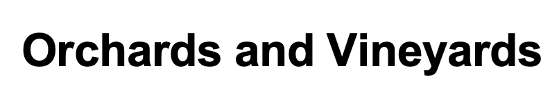

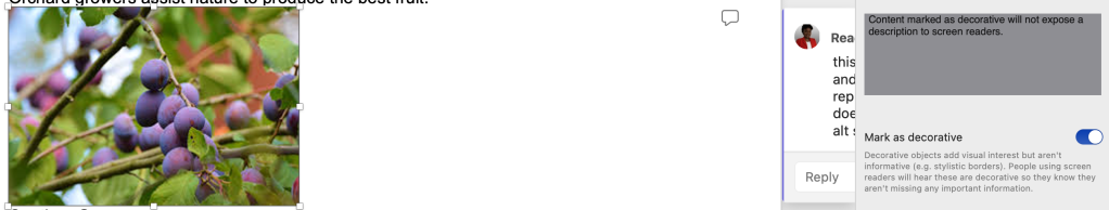
2. Image Alt Text
Issue: The image caption only said “Orchard,” providing no context.
Fix: I replaced it with descriptive alt text: “A fruit orchard in full bloom, illustrating the concept of growth and renewal in learning.”
3. Decorative Image Misuse
Issue: A decorative image still contained alt text, creating unnecessary audio clutter for screen readers.
Fix: I set the alt attribute to blank (alt="") so screen readers skip it.
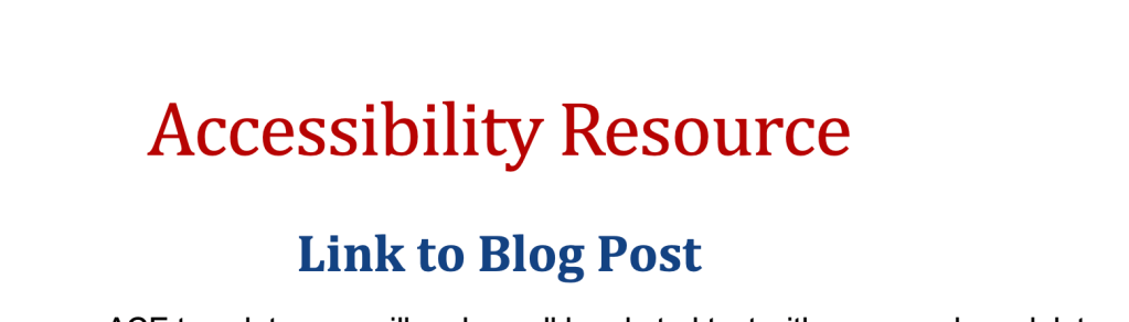
4. Low Contrast in Red Heading Text
Issue: The main heading “Accessibility Resource” appeared in red, with a contrast ratio below 4.5:1, making it difficult to read.
Fix: Replaced red text with a high-contrast color (dark navy) and applied a proper Heading 1 style to maintain visual hierarchy.
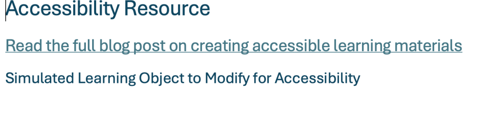
5. Non-Descriptive Link Text
Issue: The hyperlink labeled “Link to Blog Post” did not communicate its purpose or destination.
Fix: Rewrote the link text as “Read the full blog post on creating accessible learning materials” to ensure clarity and usability for screen readers.

Lack of Captions or Transcripts for Multimedia
If an audio or video explanation were added to accompany the learning object (as often happens in online instruction), it lacked closed captions or an accompanying transcript. This would make the content inaccessible to learners who are deaf or hard of hearing.
Replacement: I would create a text transcript summarizing the spoken information and recommend using tools like YouTube Auto-Captioning or Otter.ai to generate accurate captions for any video or audio files. This would ensure that all learners can access auditory content in written form.
Highlighted Accessibility Changes and Process
| Element | Issue | Action Taken | Result |
|---|---|---|---|
| Headings | Inconsistent hierarchy | Applied Word’s H1–H3 structure | Improved screen reader navigation |
| Image 1 | Caption “Orchard” lacked detail | Added descriptive alt text | Enhanced meaning for visually impaired users |
| Image 2 | Decorative but had alt text | Set alt="" | Reduced redundant narration |
| Text Color | Red text too low contrast | Changed to dark blue | Improved visibility |
| Hyperlink | Labeled “Link to Blog Post” | Rewrote to be descriptive | Clearer for screen reader users |
| Multimedia | Lack of Multimedia | Proposal for multimedia | multimedia would create a more inclusive simulated learning object |
References
Huss, J. A. (2022). A high school website is a school community’s communication center… but is it ADA compliant? School Community Journal, 32(1), 245–263.
King, C., & Piotrowski, C. (2021). Navigating the ADA accessibility requirements and legal pitfalls in online education. College Student Journal, 55(2), 127–134.
Rybin Koob, A., Ibacache Oliva, K. S., Williamson, M., Lamont-Manfre, M., Hugen, A., & Dickerson, A. (2022). Tech tools in pandemic-transformed information literacy instruction: Pushing for digital accessibility. Information Technology & Libraries, 41(4), 1–32. https://doi.org/10.6017/ital.v41i4.15383
